In late March, Holly from Naked Apple Cider House reached out with the exciting news that they had finally been granted a license for distribution! This significant milestone had been long awaited, in the pipeline for over 10 years and set a bunch of tasks into fast action, including the design of a can label to make their product jump off the shelf!
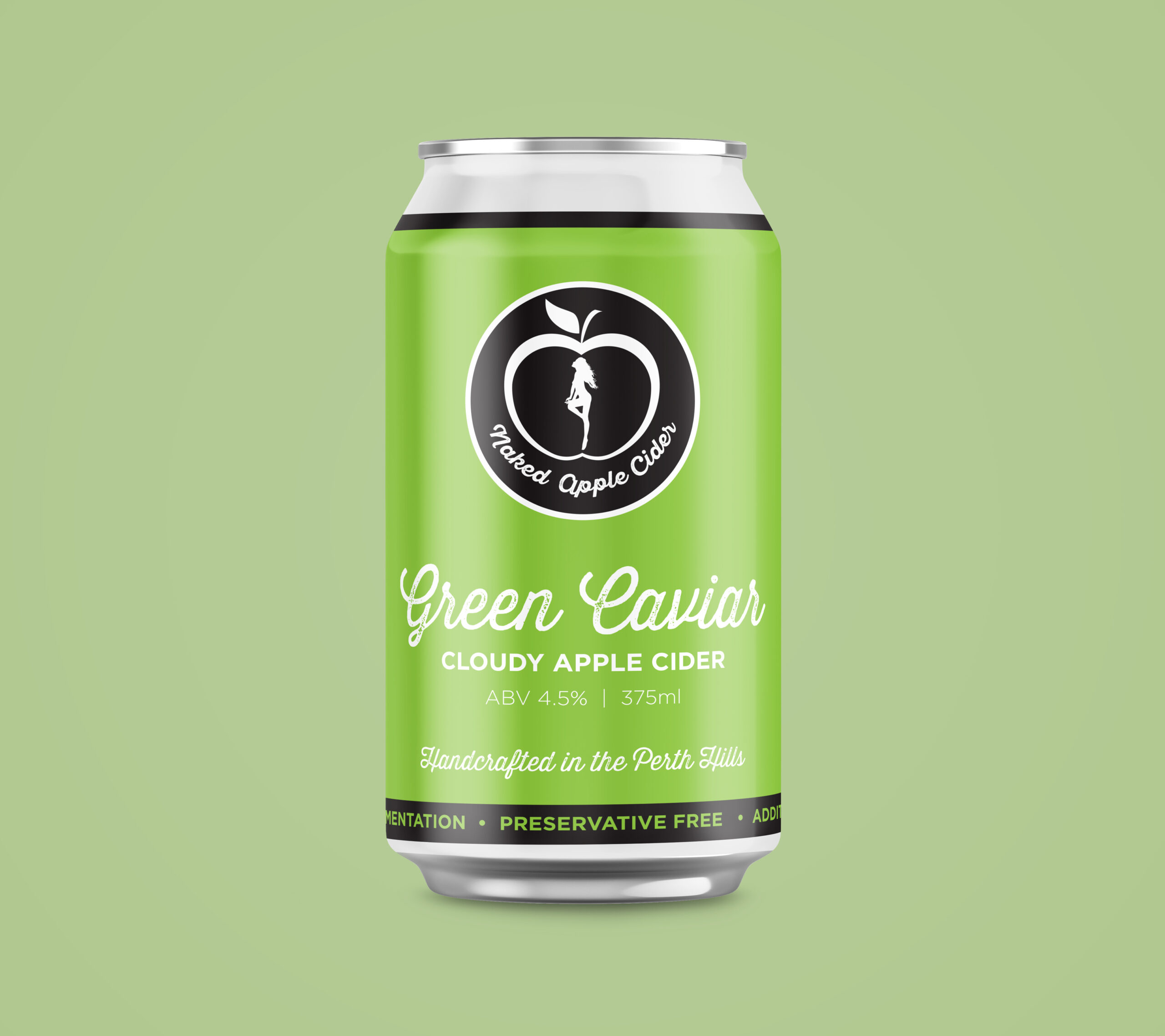
I’ve worked with Naked Apple on a few projects now and being fellow “hills people”, along with my background in hospitality, it’s been a pretty great fit so far. But the opportunity to create the can design for their flagship cloudy apple cider, Green Caviar, and first foray into distribution was quite the privilege.
We looked at a few design options, keeping inline with their current branding which has been with them since their early beginnings so holds a real sentimental value for them. There are set colours for each of their ciders and this crisp apple green is attached to the Green Caviar so that was a non-negotiable.
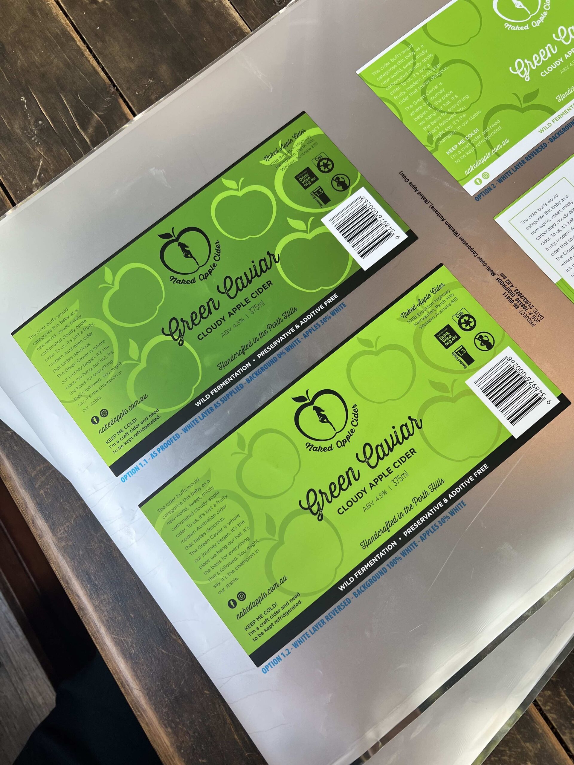
We also needed to consider the other ciders in the range (which will eventually be released) with their corresponding colours and how they might play out with the can design later on down the track. The entire range must look consistent and cohesive. We also explored incorporating their current tap decal design. We looked a loads of label samples to consider out what finishes might work well for this project and ended up going with a silver label which allows you to create a metallic effect.
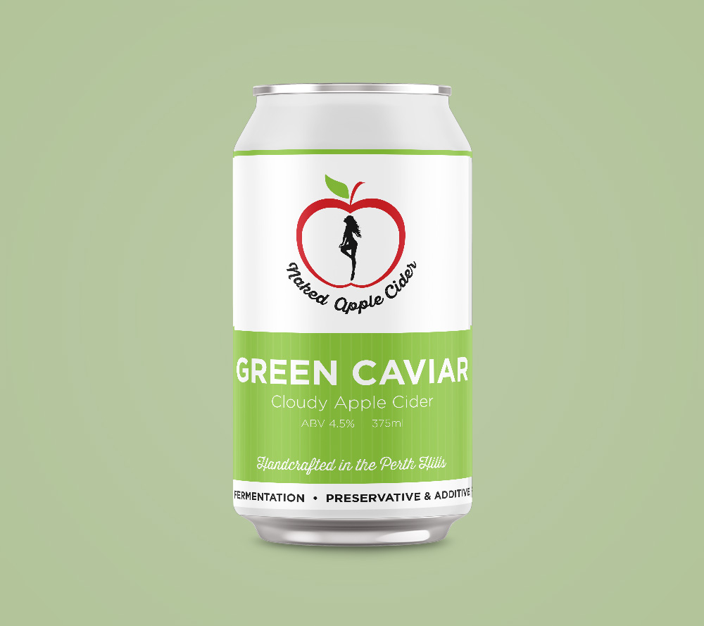
I love to provide clients with mockups so that can visualise the design in action without having to apply too much on imagination. The difference in how you perceive the design in use vs. a flat image on a screen is quite significant! Here are a few of the unused designs.
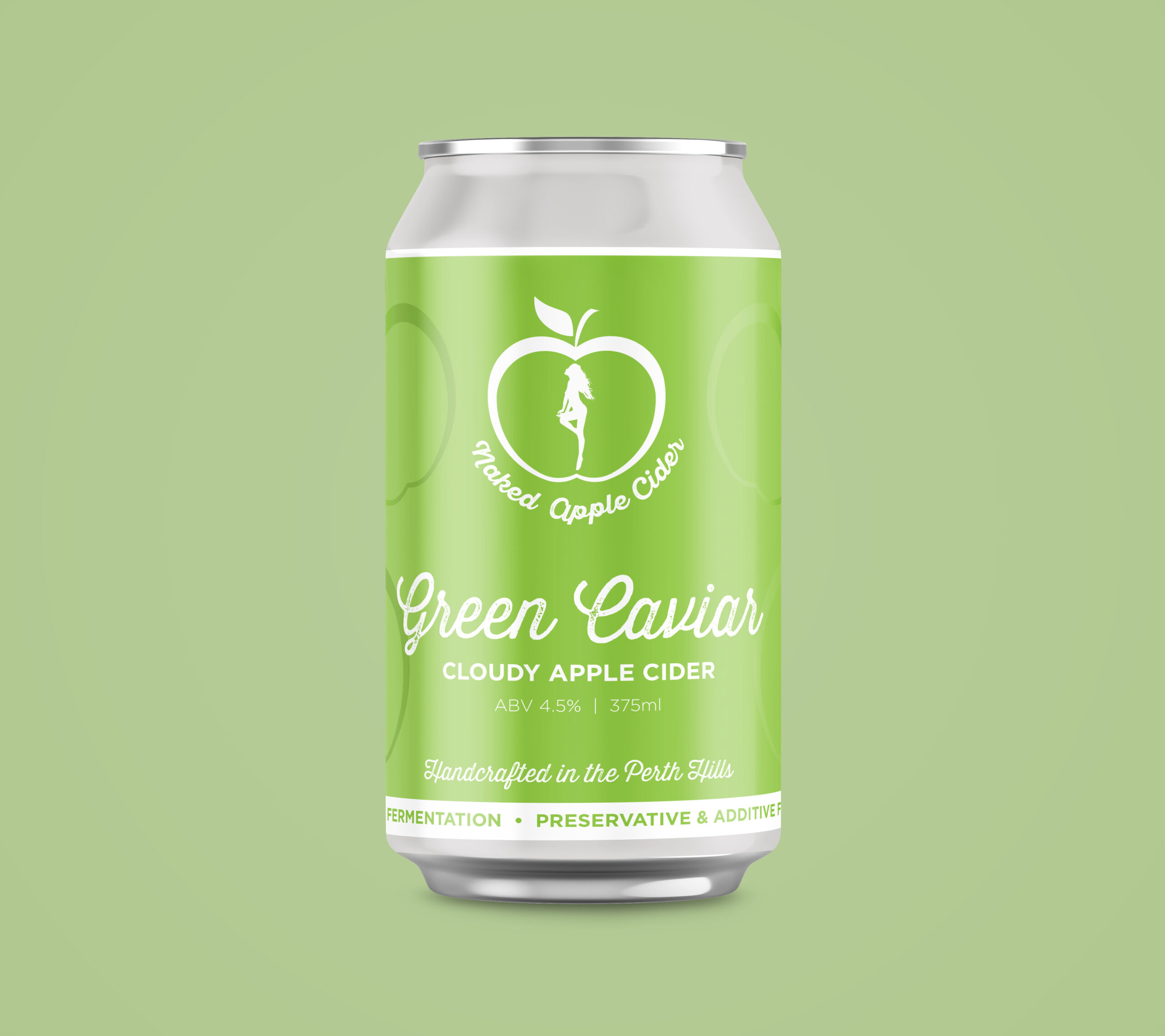
Initially, based on the mockups I felt the white on green design would be the clear winner however the next stage was to view printed proofs to see how the metallic finish would appear. Printed on a silver sticker we adjusted the levels of white ink opacity (under the green panel) in order to achieve varying levels of metallic effect for the apple and stripes patterns. This looks super cool on the can as it emulates the look of it being printed directly onto the aluminium can rather than it just looking like a matte label/sticker.
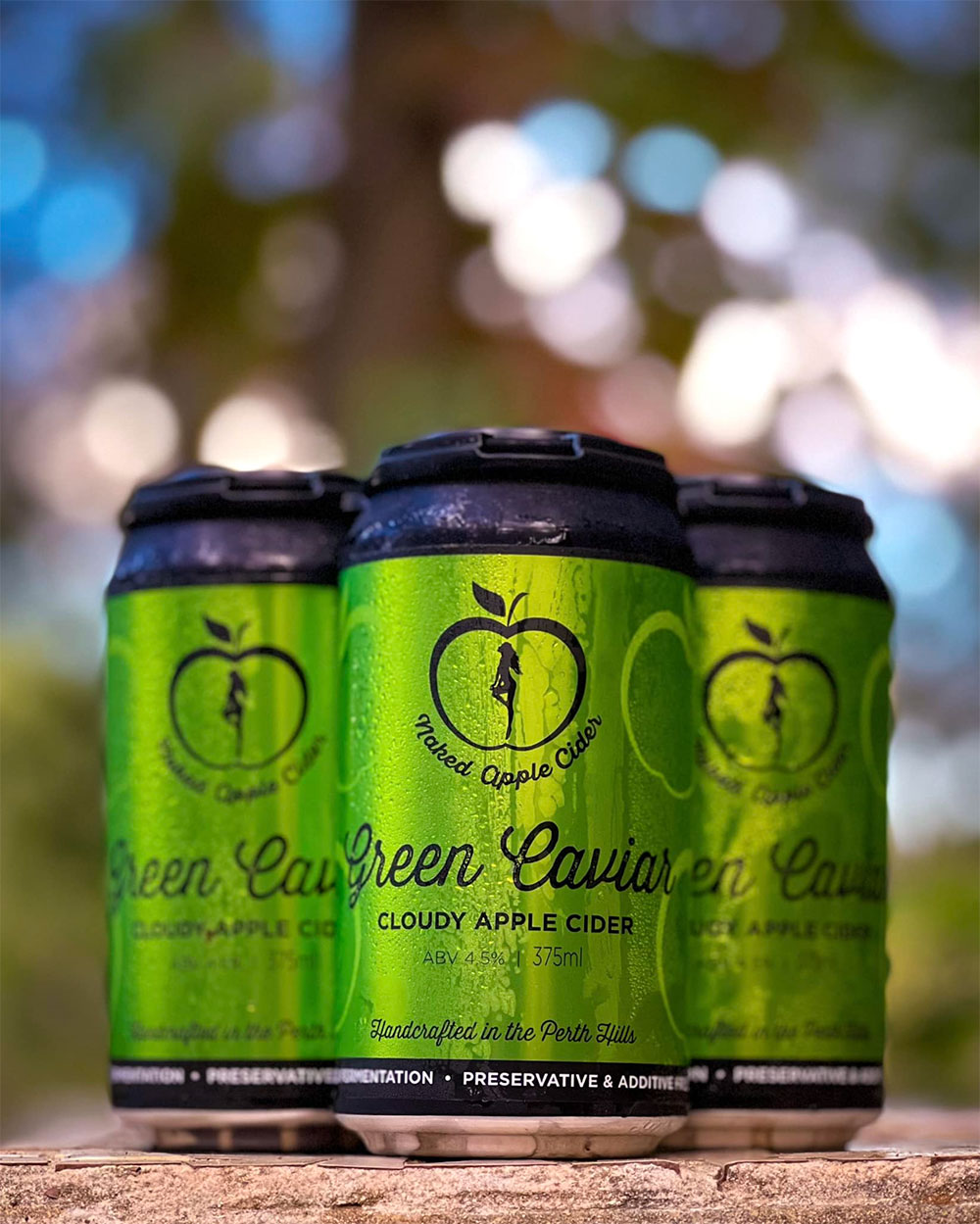
The labels actually looked better in real life, the way the light catches the metallic elements was awesome, particularly impactful on the black on green design. The proofs were also tested on actual cans to see how they looked on a fridge shelf etc – it was a very thorough process to ensure the best design won! Once the option to use a black can was tabled the decision was pretty clear.
Melissa from MCC (Premium label solutions) was an enormous help in this process providing a ton of samples, digital proofs and professional advice. She also hand delivered the labels the day before canning! How’s that for service!?

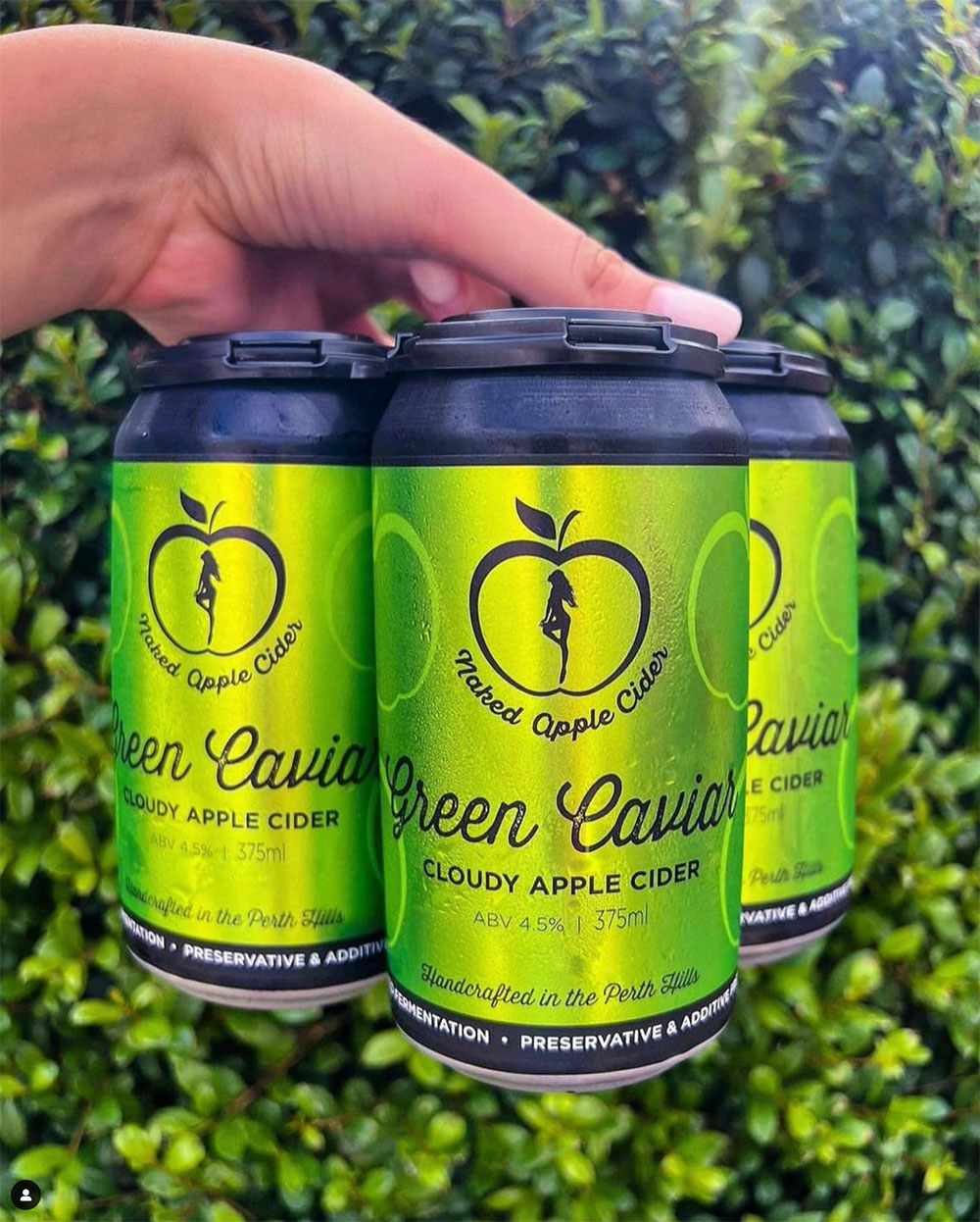
At the end of the day the eye catching design below won the hearts of the team at NAC and I’m personally beyond stoked with the final result. It was a real team effort nailing down this design with the gang at Naked Apple and I’d like to thank them so much for bringing me in on such a fun and precious project! We managed to turn it around, from initial mockups to selling can at the venue, in under a month which is outstanding when you think about the time for the design development, print processes and the canning!!
Green Caviar is on sale now at Naked Apple Cider in Karragullen, drop into venue at 1088 Brookton Hwy and pick yourself up a 4 pack (or carton!). And keep an eye out for the rest of the range which is coming soon!