
Nowadays heaps of people DIY design for their business with various apps like Canva. It’s a such great platform but without any training in design it can still be tricky to make it look professional AND create a consistent feed.
Here are some simple hacks to try on your type, whether you are placing text on top of an photo or solid colour. These tips will take your designs from DIY to slick AF!
Typography Basics
You might already know these but I feel like it’s important to mention as so often I see these simple sins bring people’s designs undone:
• Place text where it is easy to read.
• Align everything the same i.e all centred, all left aligned or all right aligned.
• Rule of thirds: The text should only take up 1/3 or 2/3 of the tile space.
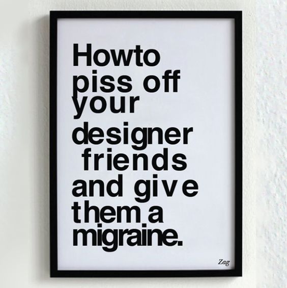
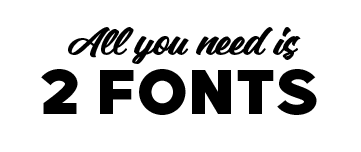
• 2 fonts, MAX! Preferably stick to 2 or 3 fonts overall for your whole band/feed. This will look less cluttered.
• Make sure there is enough margin/space from the edge.
• Use heavier fonts with enough space between the letters (tracking) so that the text is easy to ready.
• Don’t use a fine script on top of an image.
• Reduce the amount of text – say more with less – to create a calm and clean design.
What fonts?
Your Brand should have 2 fonts as part of it’s identity. Try to stick to these.
Choose fonts that suit your “Brandonality”
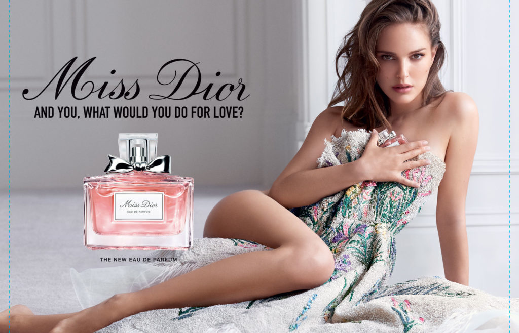
Match your font with your brand/design character eg. Feminine script style for a perfume logo. Masculine modern for power tools logo.

Select 2 fonts that compliment each other but are different enough to contrast one another eg. Script with a Sans. Or a Serif with a Block Sans, Tall with short, bold with fine.
Use Font pairs!
How to choose 2 fonts that compliment each other but also contrast one another? FONT PAIRING! Many fonts are designed with a perfect partner. When you are looking for fonts try searching for a pair to find the prettiest of partners.
Download some FREE font pairs here:https://fontpair.co
This site helps you find a match for your existing font: https://fontjoy.com
And of course everybody’s favourite Canva has some help https://www.canva.com/learn/the-ultimate-guide-to-font-pairing/
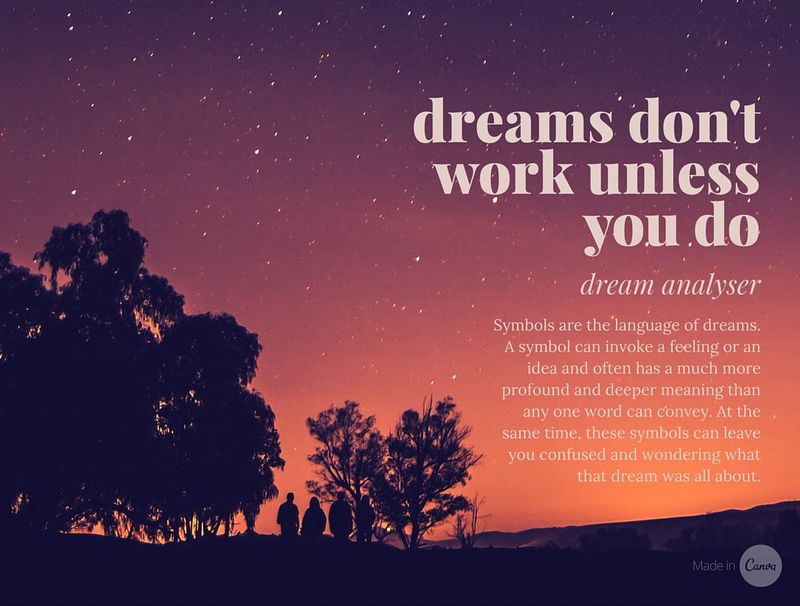
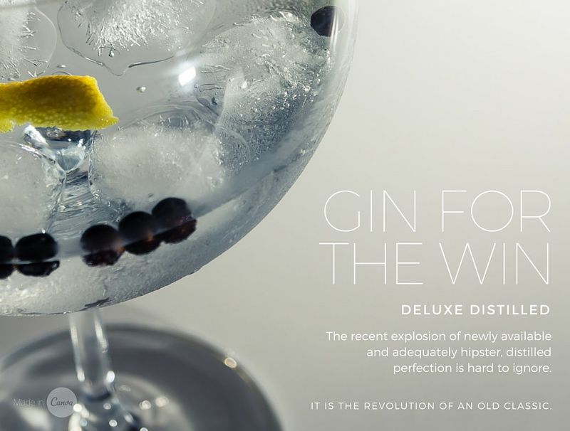
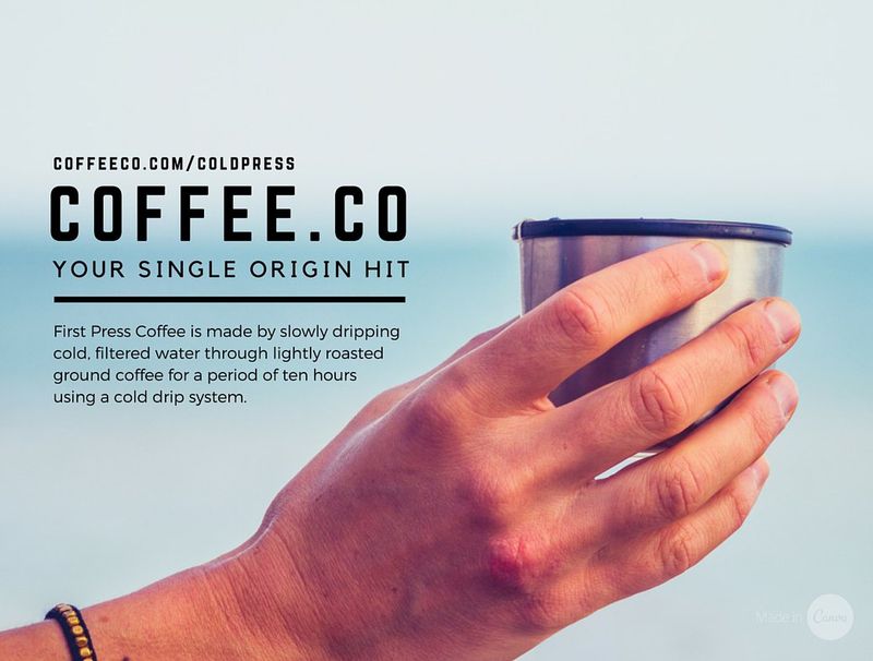
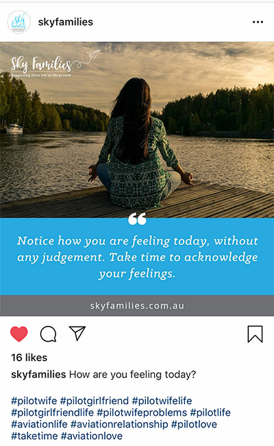
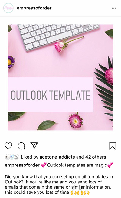
The Image
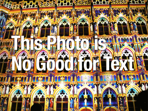
When choosing an image try to go for something that isn’t too busy (I know.. OBVIOUSLY!!!). But also consider the contrast… if there is lots of light and dark, or lots of details it’s not a great image to use.
You want your message to be easy to read so place it in empty areas.
Cropping the image in a different way can create a better space to use.
If YOU are taking the photo consider this and removed all the clutter and unnecessary items from the background. You could also invest in a backdrop or some sort – check out The Creative Republic for photographic backdrops
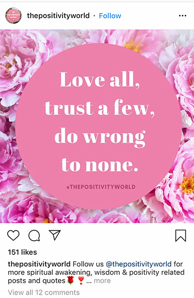
Try Overlays!
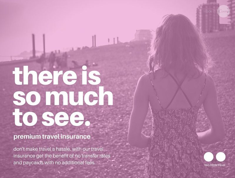
Create a block graphic to lay on top of the image, either a solid colour or a translucent, then place the text on top of that.
Or add a translucent colour over the whole image?
Stick to you brand colours and fonts!

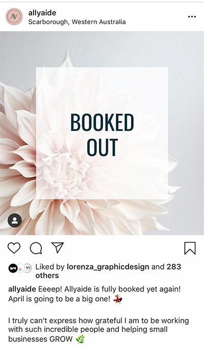

No Photo Post
Do you really need a photo? If not, a solid block colour (your brand colours of course) can look really effective if you speckle them throughout your feed. Create a template and perhaps swap out the background colour every second time.
Keep the message short and sweet so it can be easily read when looking at the whole feed. Don’t forget to apply all of the basic typography tips listed above!

How to be consistent
Use Canva to set up a few different post templates for your Instagram and then stick to them.
Try creating these ones and see how they lift the overall consistency of your feed:
– Overlaying text on a photo
– Solid block colour background with text
– Image with translucent colour overlay and text
Use can also use an app like Planoly or Preview to visually plan your posts, decide if they are too busy or OK and to rearrange your grid to find the best layout before posting.
Free font sites!
As promised here’s some awesome sites for FREE fonts:
https://www.fontfabric.com/fonts/?sort=free-fonts
https://freedesignresources.net/category/free-fonts/
